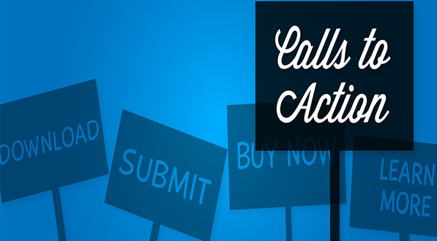
What Is a CTA or Call to Action?

CTA یا کال تو اکشن چیست؟

فهرست مطالب

When you search online for a product or service, you have likely come across buttons that encourage you to take a specific action: Buy Now, Sign Up for Free, or Get a Consultation. These buttons, known in digital marketing as Call to Action, or simply CTA, serve as the bridge between your content and the customer’s final decision.

But why do some of these buttons get clicked while others are simply ignored? How can you design a CTA that actually delivers results? In this article from LimooShirin Digital Marketing Agency, we take an in-depth look at Call-to-Action buttons, the principles behind effective CTA design, and optimization strategies that can help you significantly increase your website’s conversion rate.

What Exactly Is a CTA and What Role Does It Play in the Sales Journey?

A Call to Action (CTA) is a key element of website design and digital marketing campaigns that guides visitors toward taking a specific action. This action could be purchasing a product, subscribing to a newsletter, downloading a file, requesting a consultation, or even watching a video.

A CTA typically appears as a colored button, a highlighted text link, or an interactive banner. Common CTA phrases include:

  • Sign Up
  • Buy Now
  • Get a Free Consultation
  • Learn More
  • Download the Catalog

These buttons play a critical role in your sales funnel, helping determine whether a visitor becomes a customer or leaves your website.
CTA دقیقاً چیست و چه نقشی در مسیر فروش دارد؟

Why Is Using a CTA Essential for an Online Business?

You may wonder whether it is really necessary to create a specific button for every desired action. The answer is a clear yes. The following reasons explain why CTAs are so important:

1. The Sales Funnel Is Incomplete Without a CTA

Every online business has a defined journey for guiding customers from awareness to purchase. Your content may be excellent, but if visitors do not know what to do next, the likelihood of them leaving your website increases. A CTA plays exactly this role: guiding users through the conversion journey. For example, if you have written an article about the benefits of a product, a View Product or Buy Now with a Special Discount button can direct visitors straight to the purchase page.

2. Users Need Clear Guidance

Online audiences are constantly exposed to large amounts of information and have limited time to make decisions. A clear and compelling CTA tells them: this is the action you should take next. This simple but powerful guidance can make the difference between an ordinary website visit and a successful conversion.

3. Digital Advertising Can Be Ineffective Without a CTA

In advertising campaigns such as Google Ads, Instagram Ads, or email marketing, you have limited space and time to capture your audience’s attention. A strong CTA can be the difference between getting a click and being ignored. Without a clear invitation to take action, even the most well-designed advertising campaign may fail to deliver the desired results.

How to Create an Effective and Compelling CTA

Creating a CTA button that truly delivers results requires attention to detail and a solid understanding of user behavior. Below are the key principles of designing a professional CTA:

1. Use Strong and Action-Oriented Verbs

The language of your CTA should be direct, clear, and motivating. Instead of generic phrases such as “Click Here,” use wording that communicates your value proposition:

  • Get Started Now
  • Get 30% Off
  • Get a Free Consultation
  • Download the Catalog Now

These phrases not only clearly communicate the desired action but also give users a reason to click.

2. Personalize Your CTA and Speak Directly to Your Audience

Using words such as “you” or “my” can create a sense of personalization and increase conversion rates. For example:

  • I Want My Free Gift
  • Reserve My Seat
  • Start My Free Trial

These types of phrases make users feel that the offer has been designed specifically for them.

3. Don’t Underestimate the Power of the Word “Free”

Research suggests that adding the word “Free” to a CTA can significantly increase click-through rates. Examples include:

  • Download the Free Guide
  • Get a Free Consultation
  • Sign Up for Free — No Credit Card Required

The word “free” reduces the perceived risk for users and encourages them to try the offer.

4. Know Your Target Audience

Every industry and audience has different needs and expectations. A successful CTA should align with your audience’s language, needs, and pain points. For example:

  • For an online store: Shop with Free Delivery
  • For a consulting agency: Book a Consultation
  • For an educational blog: Download the Free Checklist

5. Create a Sense of Urgency

Time or quantity limitations can encourage users to make decisions faster. Examples include:

  • 50% Off — Today Only
  • Only 10 Left
  • Special Offer Until the End of the Week

This technique is particularly effective for seasonal promotions or limited-stock products.

Three Golden Rules for CTA Visual Design

Text is only one part of the equation. The visual design of your CTA button plays a critical role in capturing attention and increasing click-through rates.

1. Strategic Placement

Your CTA should be placed where it can be easily noticed. Commonly effective locations include:

  • Above the Fold: Where users can see it without scrolling
  • At the End of the Main Content: After the user has received enough information to make a decision
  • Next to Engaging Visuals: To attract visual attention

You can also use multiple CTAs on a single page, provided they have a clear purpose and a well-defined hierarchy.

2. Distinctive and Engaging Visual Design

The color, size, and shape of the button should distinguish it from the other elements on the page:

  • Color: Use colors that contrast with the background. For example, if your website is primarily blue, an orange or green button can stand out.
  • Size: The button should be large enough to be noticeable without becoming distracting, but not so small that users overlook it.
  • White Space: Leave enough space around the button so the user’s eye can easily identify it.

3. Clear and Unambiguous Messaging

Users should immediately understand what will happen when they click the button. Avoid vague phrases such as “Continue” or “Next” and use descriptive wording instead:

  • View Our Portfolio
  • Get the Final Price
  • Start the Course

Where Should You Place a Call-to-Action Button?

One of the key factors in the success of a CTA button is choosing the right placement so that it is both easily accessible and highly visible. Determining the best position may sometimes require experience, consultation with specialists, or A/B testing.

In general, the end of the content or page is considered an effective placement because users are more prepared to make a decision after reading the content. However, CTAs can also be placed at the top of the page, in the sidebar, within pop-up messages, on product pages, advertising banners, slides, or sticky menus, ensuring that users can take action whenever they are ready.

The important point is that excessive repetition or poor placement should not annoy users or reduce their willingness to click. Instead, the CTA should be designed to enhance the user experience and increase conversions.

How to Run an A/B Test

In an A/B test, you show two versions of the same CTA to two different groups of users and compare the results. The elements you can test include:

1. Button Color

Is a green button more effective than an orange one? Does the color red create a stronger sense of urgency?

2. CTA Text

Is “Shop Now” more effective than “Add to Cart”? Is “Get a Consultation” more compelling than “Contact Us”?

3. Size and Shape

Is a rounded button more effective than a rectangular one? Does a larger button generate a higher click-through rate?

4. Placement

Is placing the CTA at the top of the page more effective than placing it at the end?

5. Visual Effects

Can adding a shadow, animation, or a color change on hover increase the click-through rate?

By conducting continuous A/B tests, you can gradually optimize your CTAs, improve the user experience, and increase your conversion rate.

Conclusion

Call-to-Action buttons are more than just a design element; they are a strategic tool for guiding users through the conversion journey. A successful CTA combines compelling copy, engaging design, and strategic placement.

However, keep in mind that there is no one-size-fits-all formula. What works for one business may produce different results for another. The key to success lies in continuous testing, data analysis, and ongoing optimization.

If you want to professionally design and optimize your website’s CTAs and maximize your conversion rate, LimooShirin Digital Marketing Agency is ready to help. With experience in digital campaign design and user experience optimization, we can help you turn more visitors into potential customers and drive meaningful business growth.

Table of Contents

Share Via:

You can share this page with your friends using the following methods.

consultation form

Contact Us

021-91072261